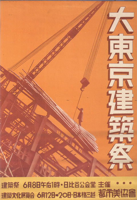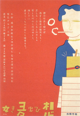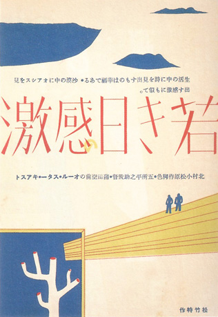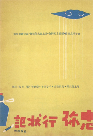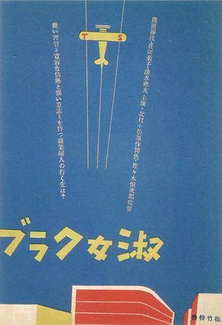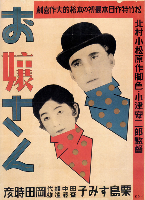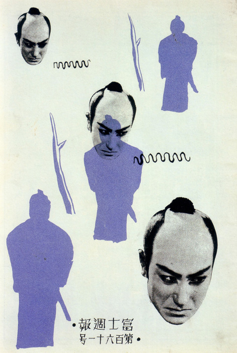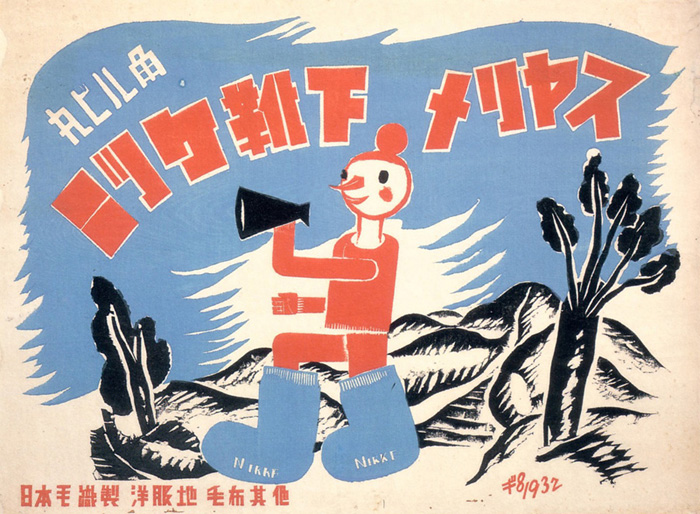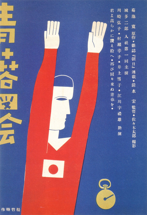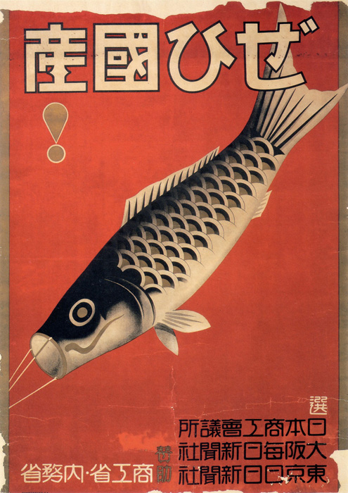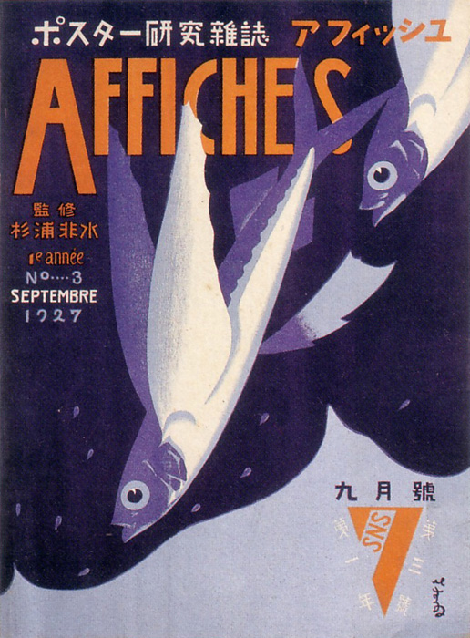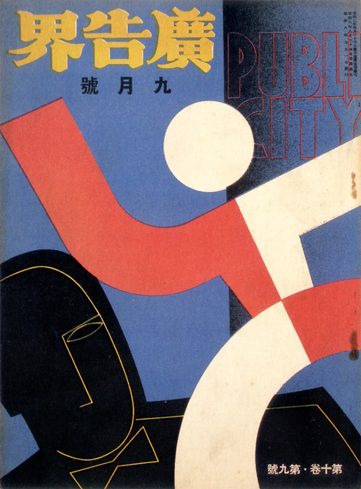
Link: Website of ”pink tentacle“ ...
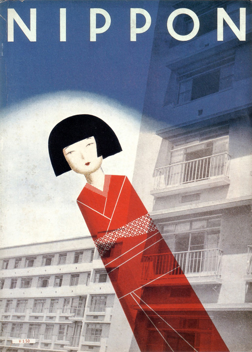
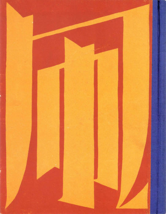
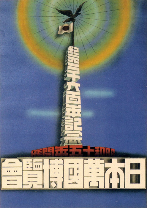
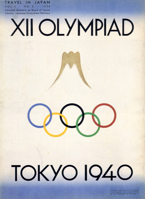
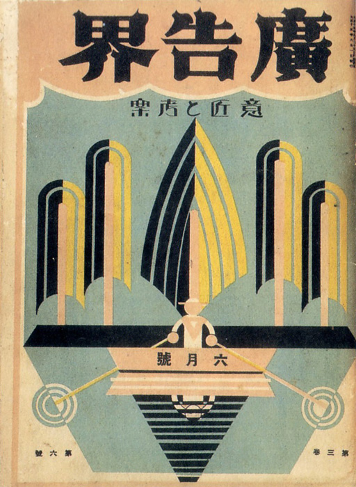
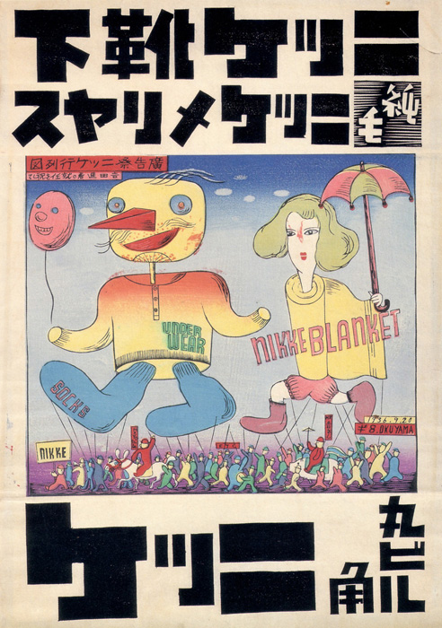
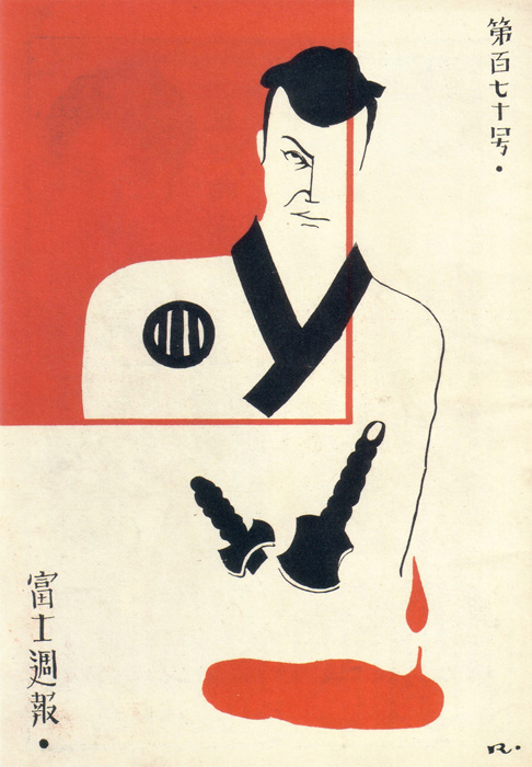
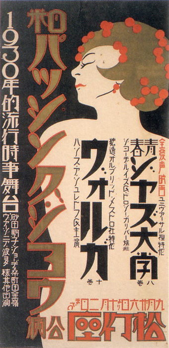
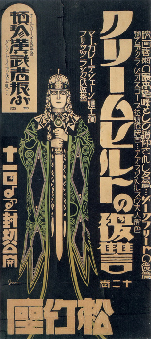
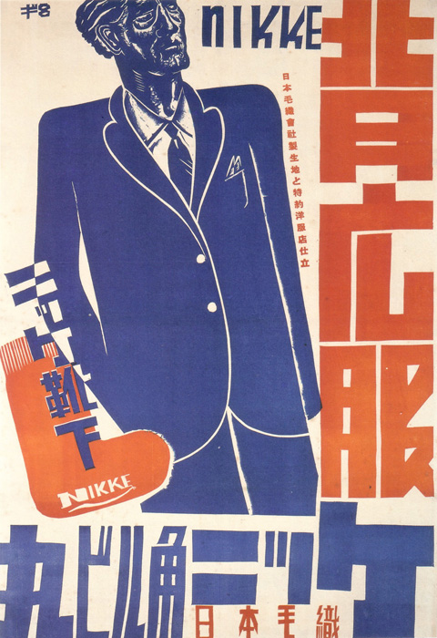
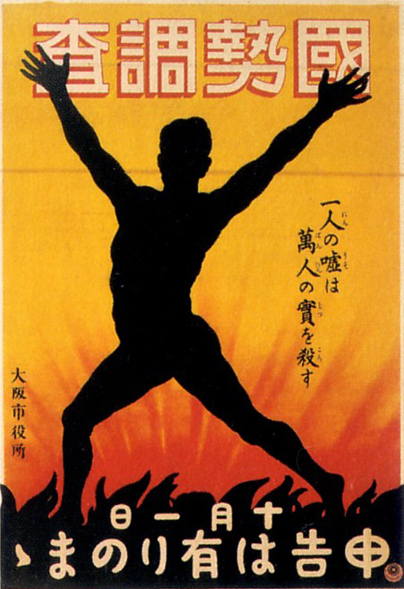
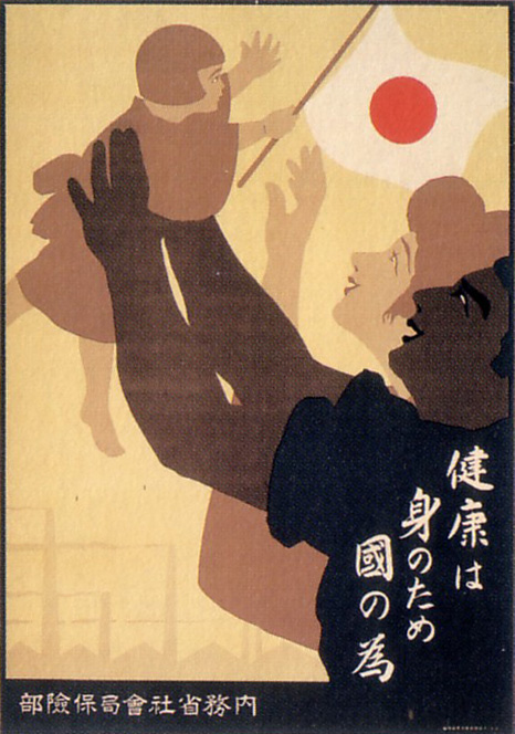
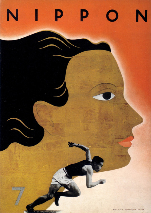
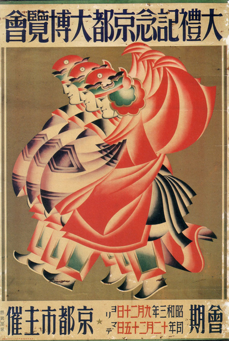
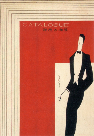
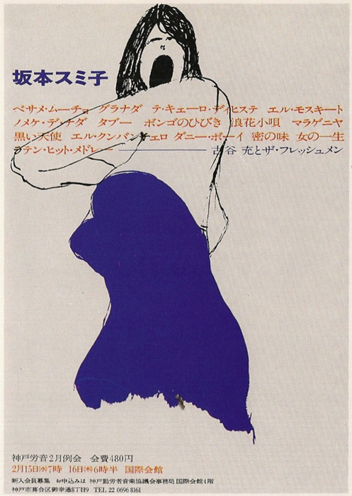
Source: Modernism on Paper | Japanese Graphic Design of the 1920s-30s (published 2003)

Link: Website of ”pink tentacle“ ...
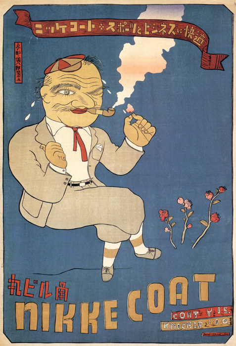
Source: Modernism on Paper | Japanese Graphic Design of the 1920s-30s (published 2003)

Link: Website of ”pink tentacle“ ...
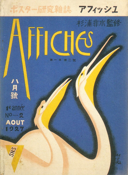
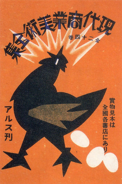
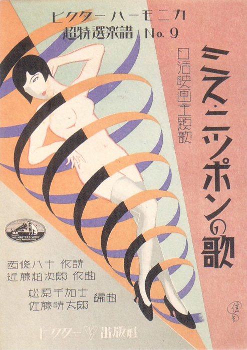
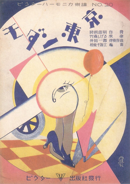
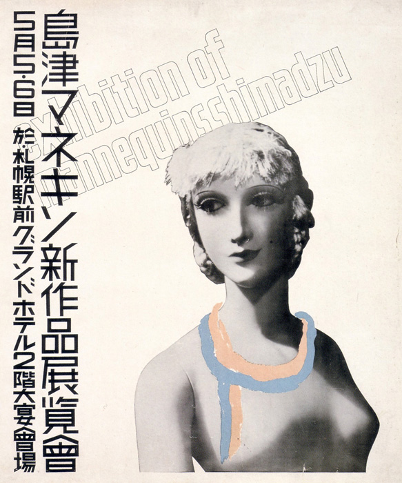
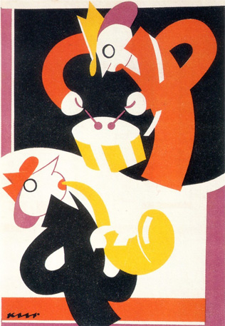
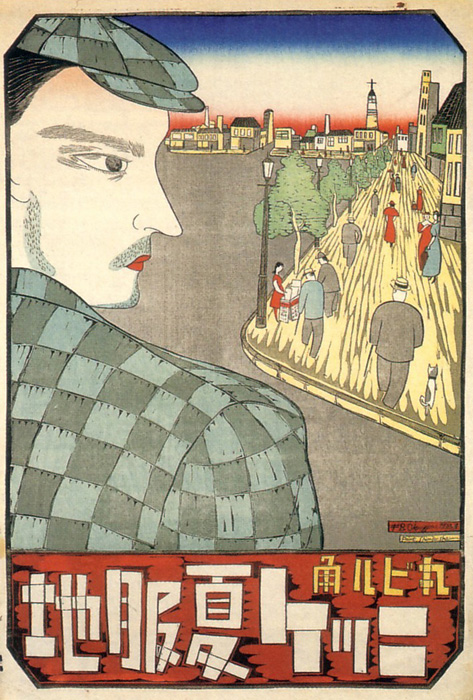
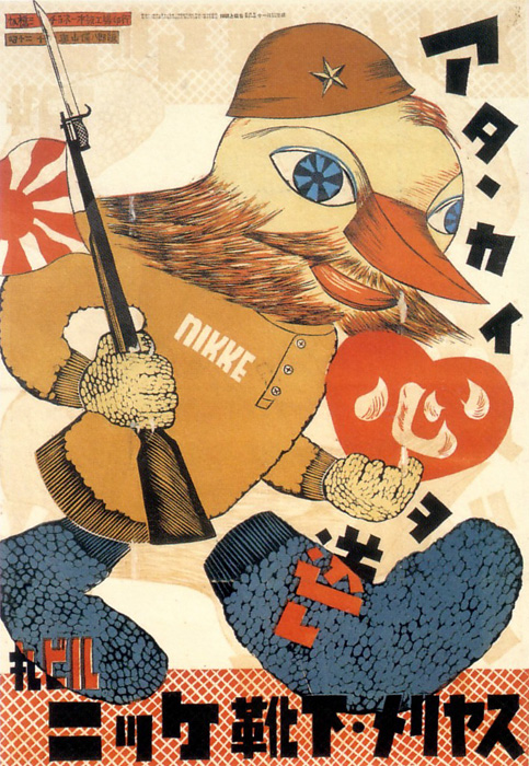
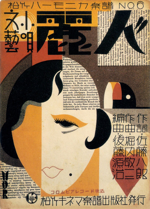
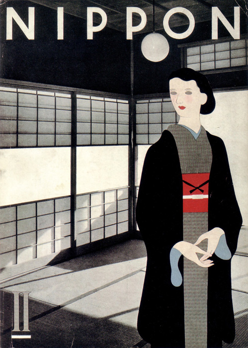
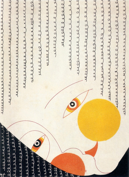
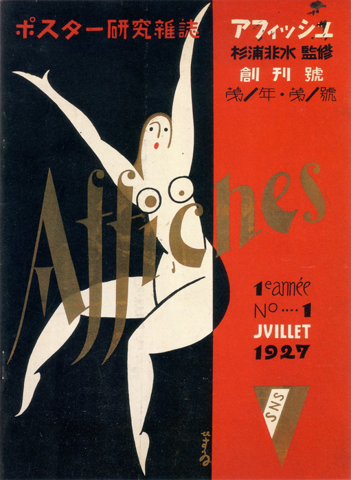
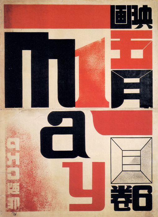
Source: Modernism on Paper | Japanese Graphic Design of the 1920s-30s (published 2003). Quote:
In the 1920s and 1930s, Japan embraced new forms of graphic design as waves of social change swept across the nation. This collection of posters, magazine covers and advertisements offer a glimpse at some of the prevailing tendencies in a society transformed by the growth of modern industry and technology, the popularity of Western art and culture, and the emergence of leftist political thought.
Link: Browse the website …
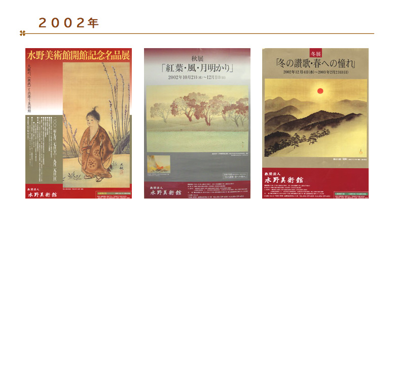
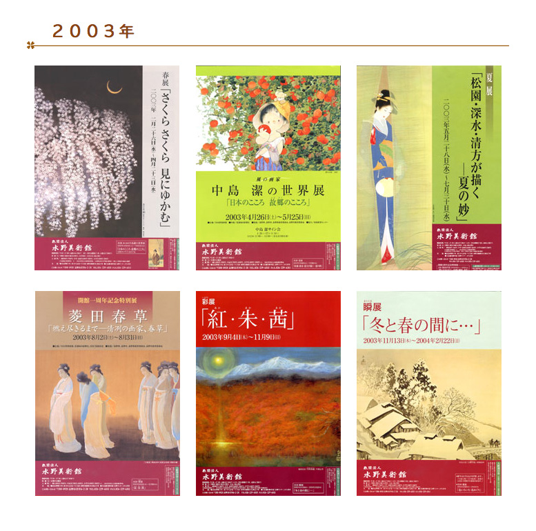
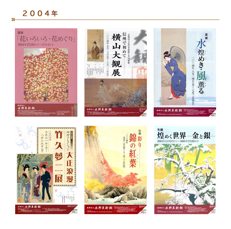
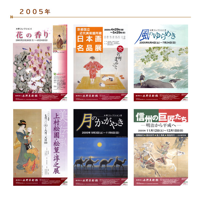
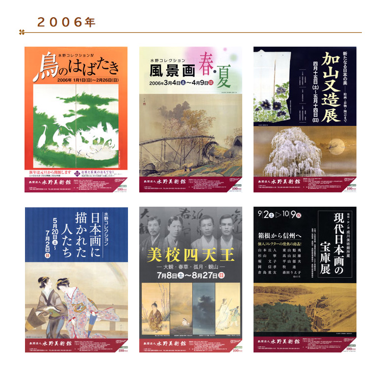
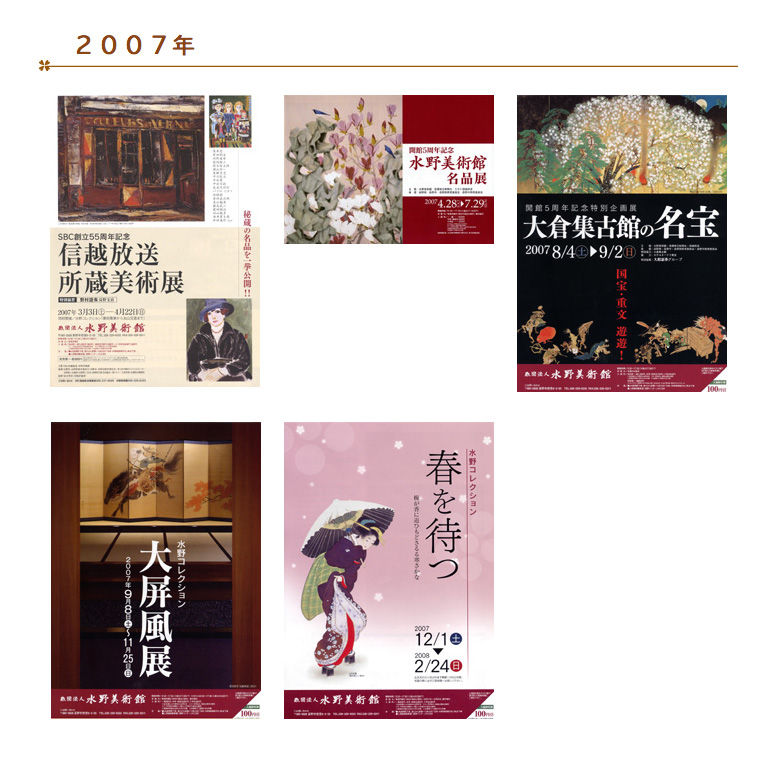
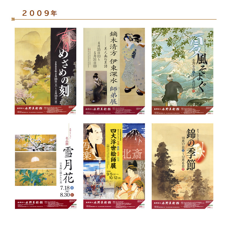
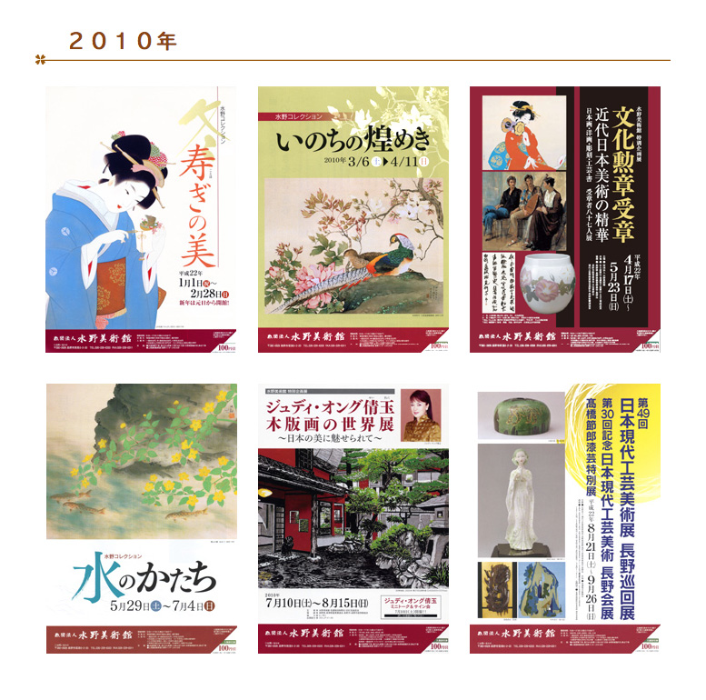
Here’s another listing of colorful museum leaflets. In the collcetion of 2004 I noticed a little change of the footer design with the dark-red bar - it was made more consistent through all following publications. These well-designed leaflets are indeed inviting to visit the museum.
My favorites are: the 3rd and 5th from 2003 and I also like the last of 2007. Everyone is welcome to post a comment with your favorites ...
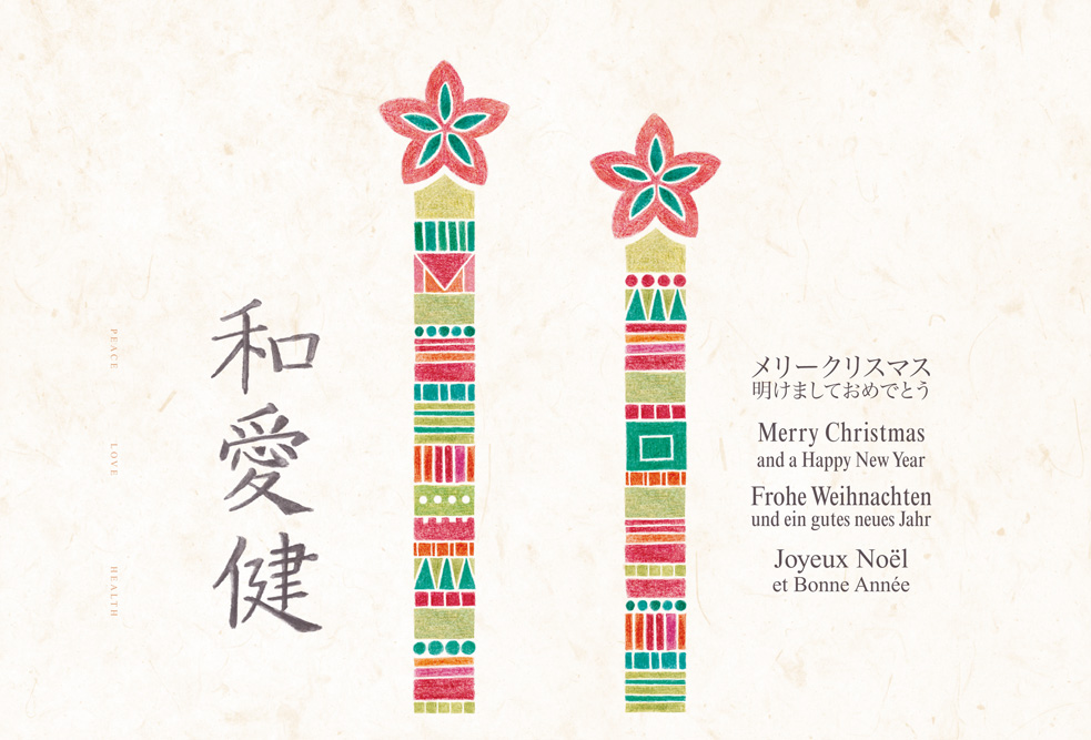
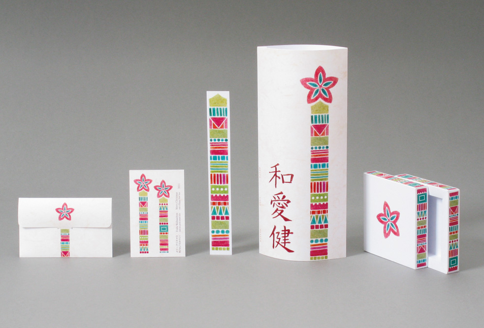
This is the design of my this year’s Christmas Card. This is not really Japanese design, but it's a Japanese inspired card, using ideas like simplicity and ’verticality’, and it's printed on Japanese paper. I’ll try to get closer to a typical but modern Japanese design for Christmas 2012.
2nd picture shows the additional objects displaying the same design: a mini-card with envelope, a bookmark, a small jewelery-box and the ’mono-version’ of the card.
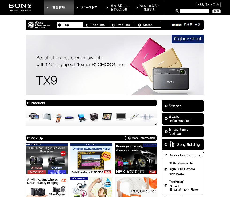
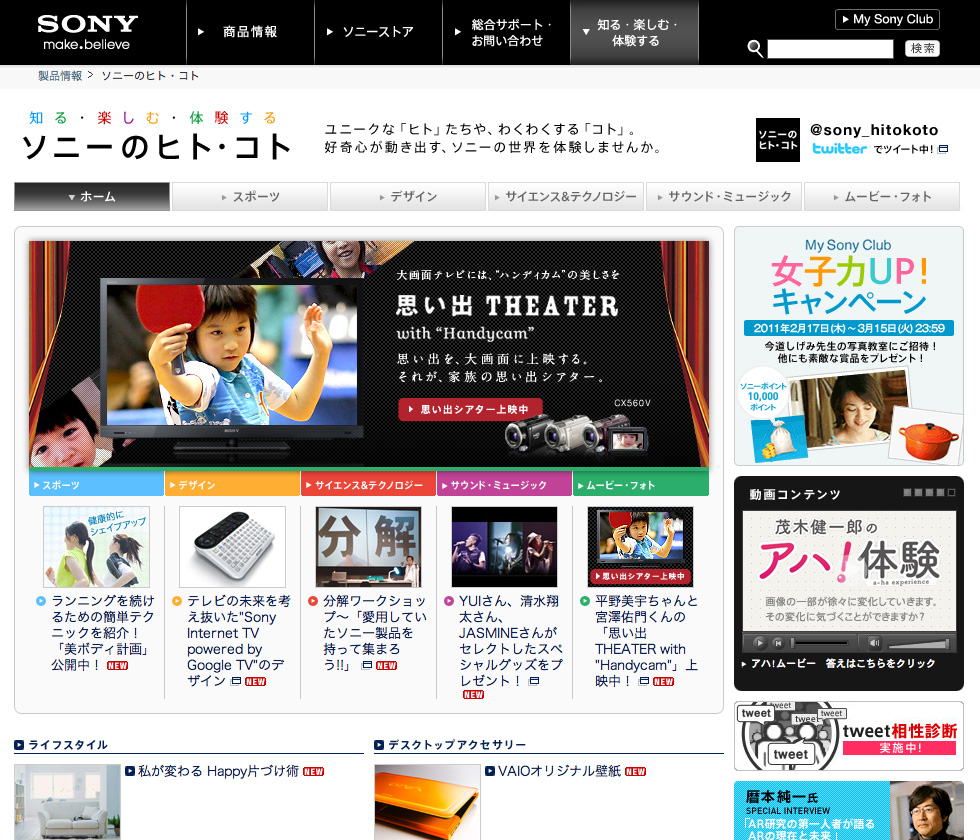
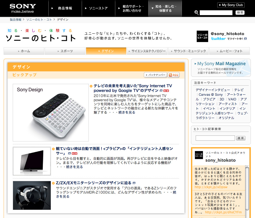
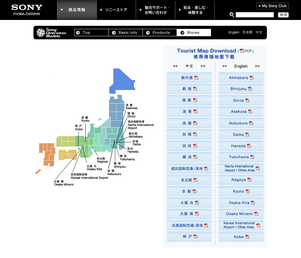
Link: Sony website …
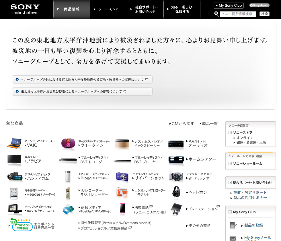
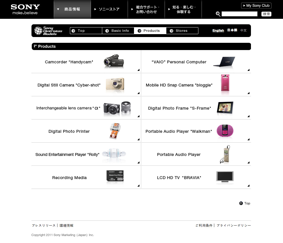
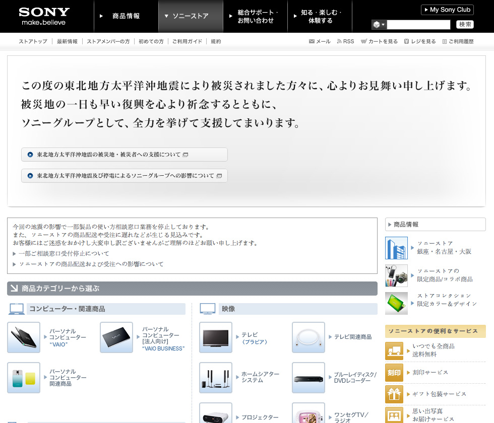
Similar to the website of Panasonic (see blog article), also Sony shows an international web-design, based on at least 4 Japan typical attributes: box-design, densley packed informations, many pictorial icons, personified product presentation.
The pages are headed by a massive black navigation bar, which can be seen the main parameter of the visual identity.
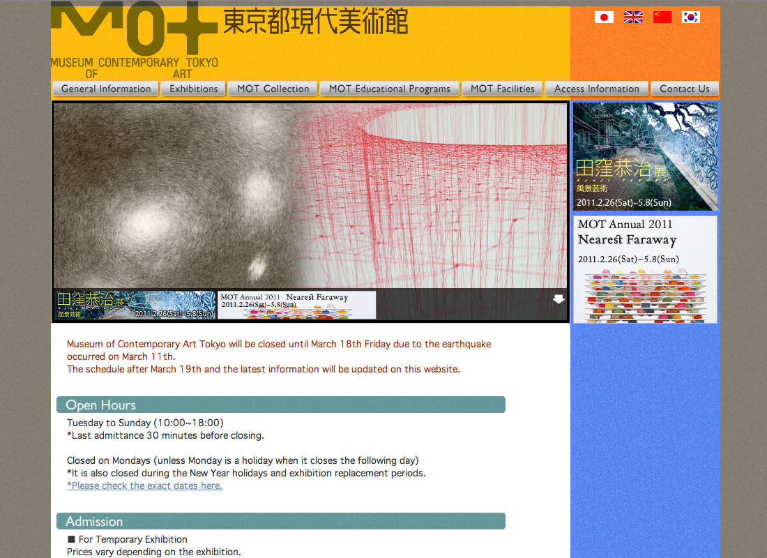
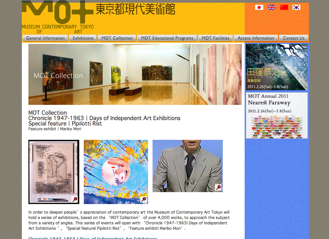
Link: Browse website …
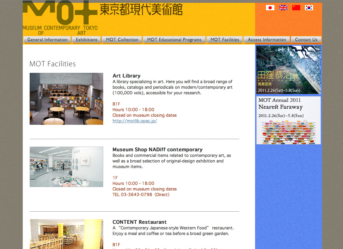
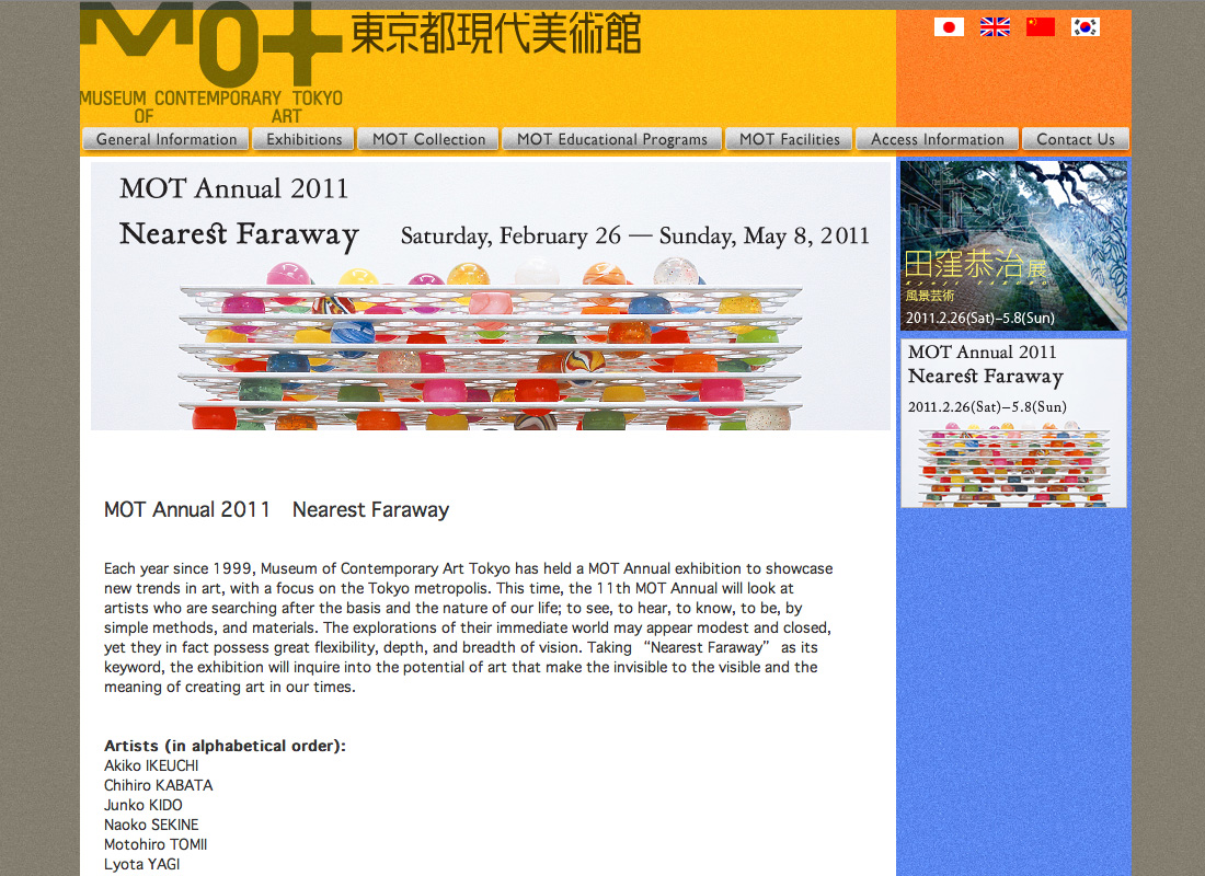
The main event of this website is the artwork of the exhibitions and of the collection. The website itself just gives the frame. If it steps back behind the artwork with an unobtrusive design, it would be any website beyond recognition and without a unique appearance. This might be the reason for the remarkable color-concept, which gets more attention on some pages, than the contents.

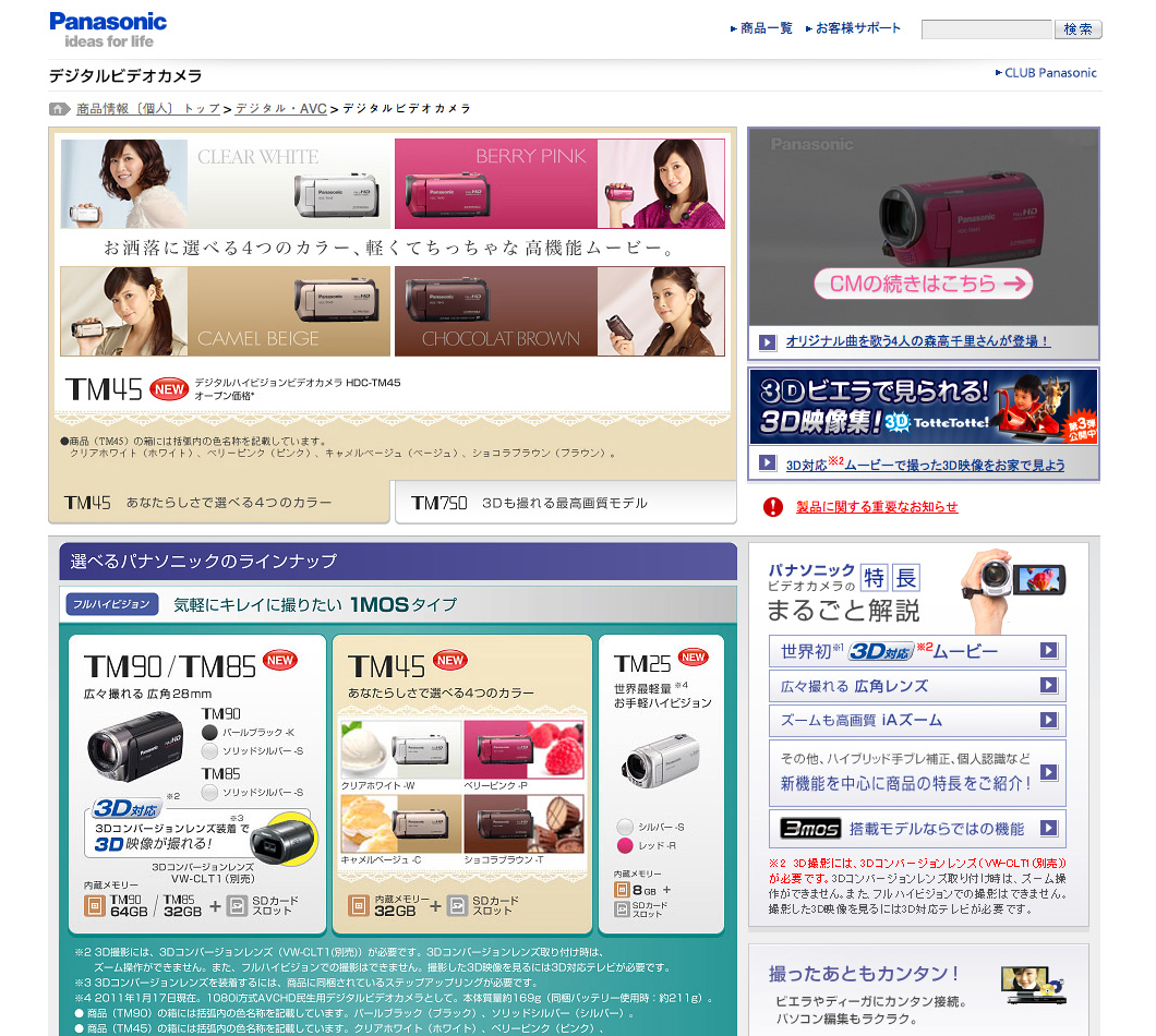
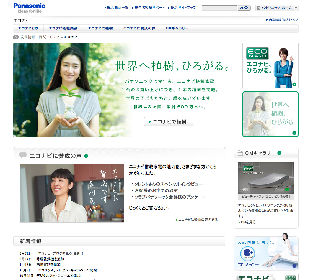
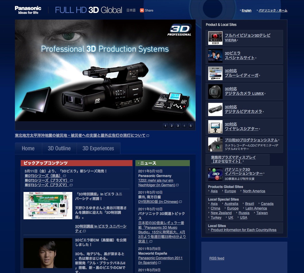
Link: Panasonic website …
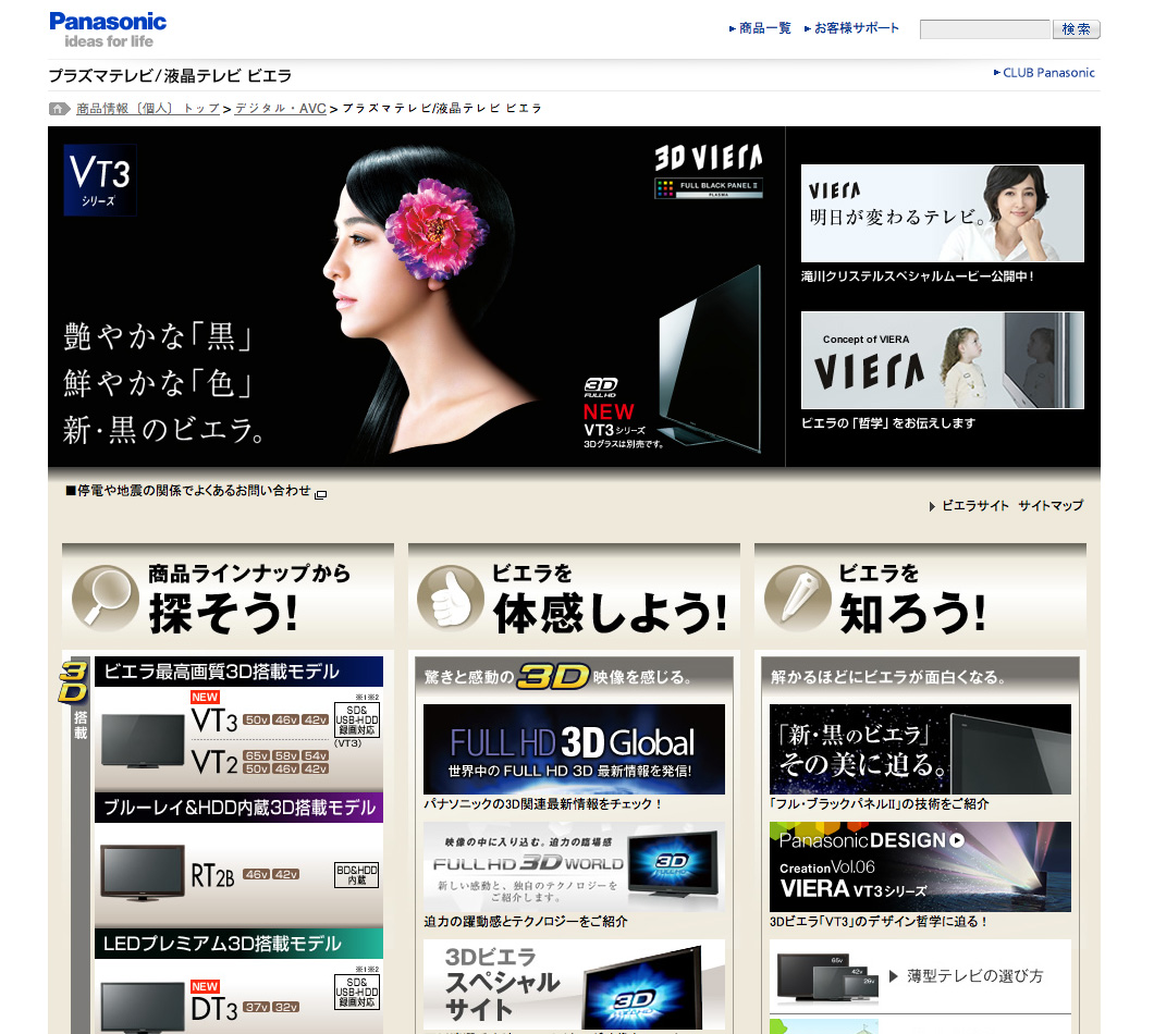
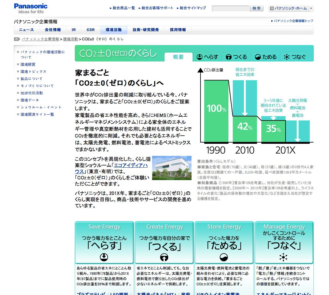
At first glance the Panasonic website shows an international and functional design. Additional it appears with that “box design” with densley information-filled pages and many pictorial icons. This seems to be typical for this category of Japanese websites. It’s conspicuous, that many products are presented with good looking people, mostly women. Very chic and descriptive: On image 1 (in picture-viewer) the colors of the cameras are visualized by tasty goodies (bottom center) or also by different styled women (top left).

On March 11th happened an earthquake of 9.0 on the Richter scale, followed by a destructive Tsunami to the north east cost of Japan. Additional a nuclear power station got out of control and threatens millions of people. My heart is sad, but I also believe in Japan's abilities to manage the disaster. My thoughts are there, I hope for worldwide solidarity.
Quote from Wikipedia:
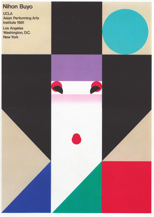
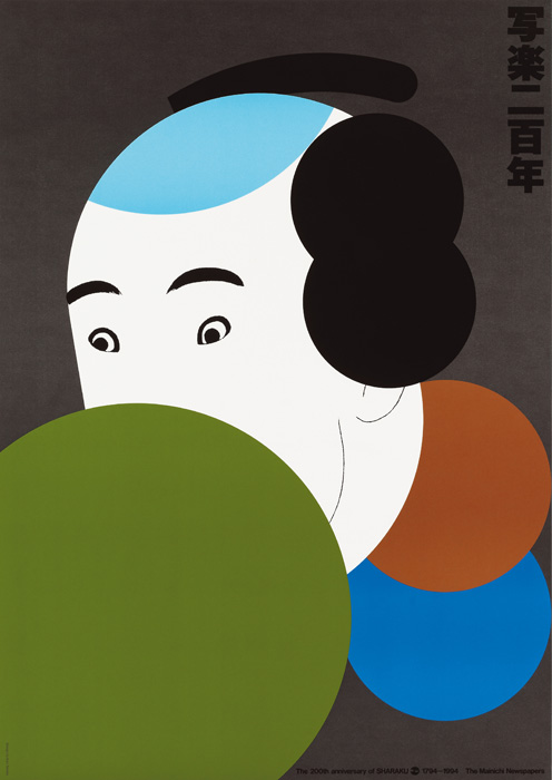
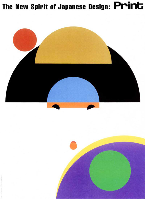
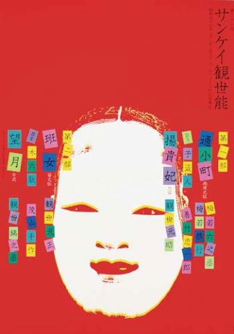
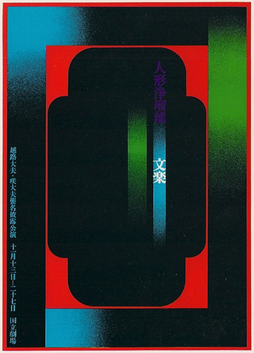
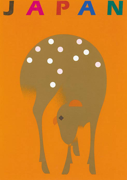
Ikko Tanaka (1930 – 2002), a well-known Japanese graphic designer. The characteristic of his designs is a blending of deeply rooted Japanese traditions with western modernism to produce contemporary visual expression. Ikko Tanaka’s work includes the design of the symbols for Expo 1985 in Tsukuba and World City Expo Tokyo 1996. Amongst others he has worked for the Seibu Saison Group, The International Garden and Greenery Exposition, Hanae Mori, Issey Miyake, and the Mazda Corporation. Tanaka has curated and designed exhibitions for the Victoria and Albert Museum (London) and throughout Japan.
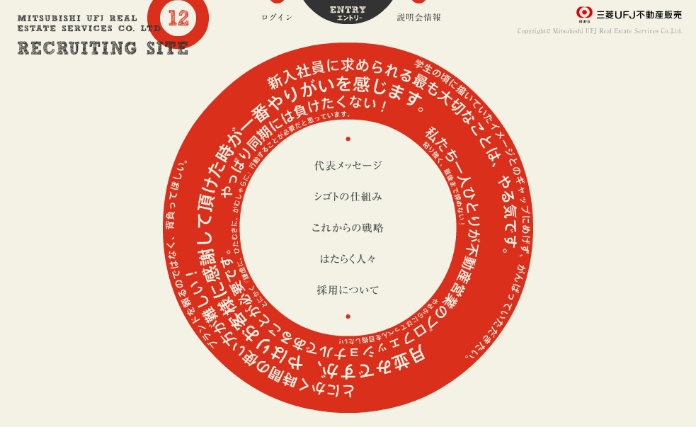
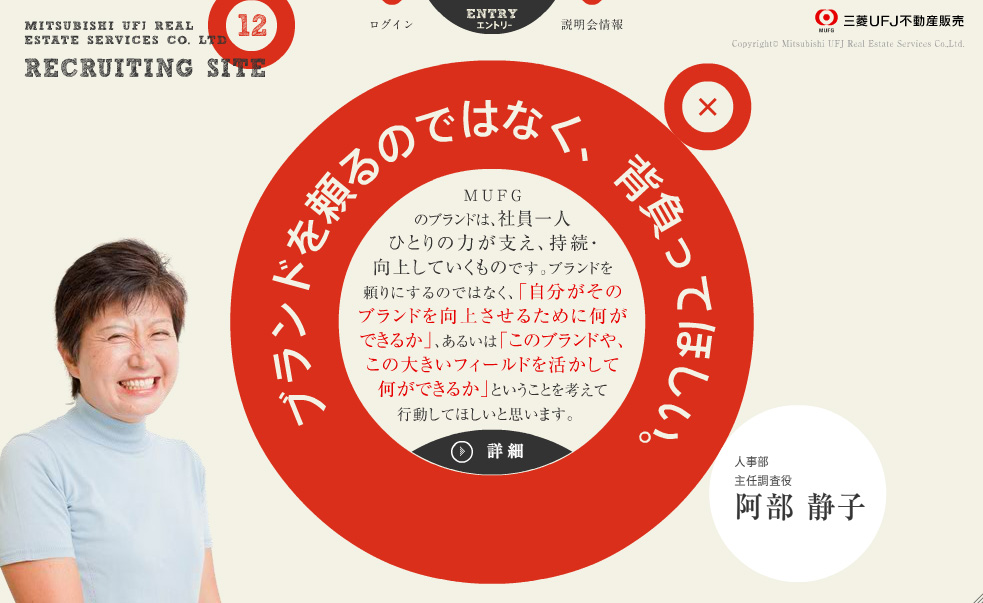
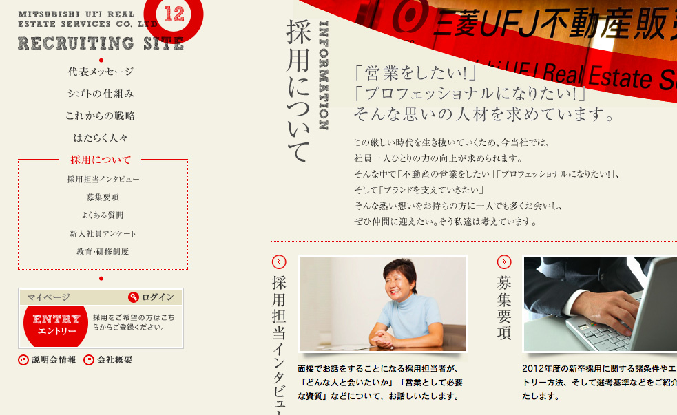
Mitsubishi UFJ Real Estate Services Co. LTD
Link: Browse website …
Perfectly made website with a unique Flash-based interface and pleasing color-concept. Also take a look on the nice hand-drawn letters of the logo-design. Great!

 On Wikipedia you can find a list of notable and commonly used emoticons or textual portrayals of a writer’s mood or facial expression in the form of icons. The Eastern emoticons are ‘eye-centered’ (^_^) while Western emoticons are ‘mouth-centered’ :-) Browse emoticons on Wikipedia ...
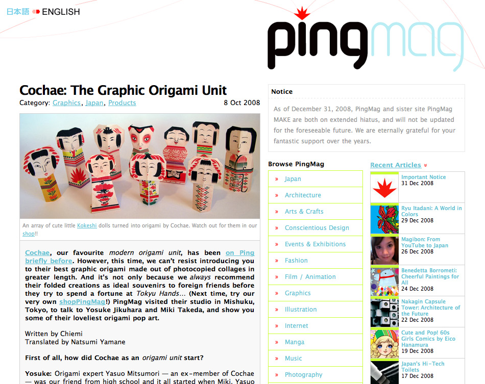
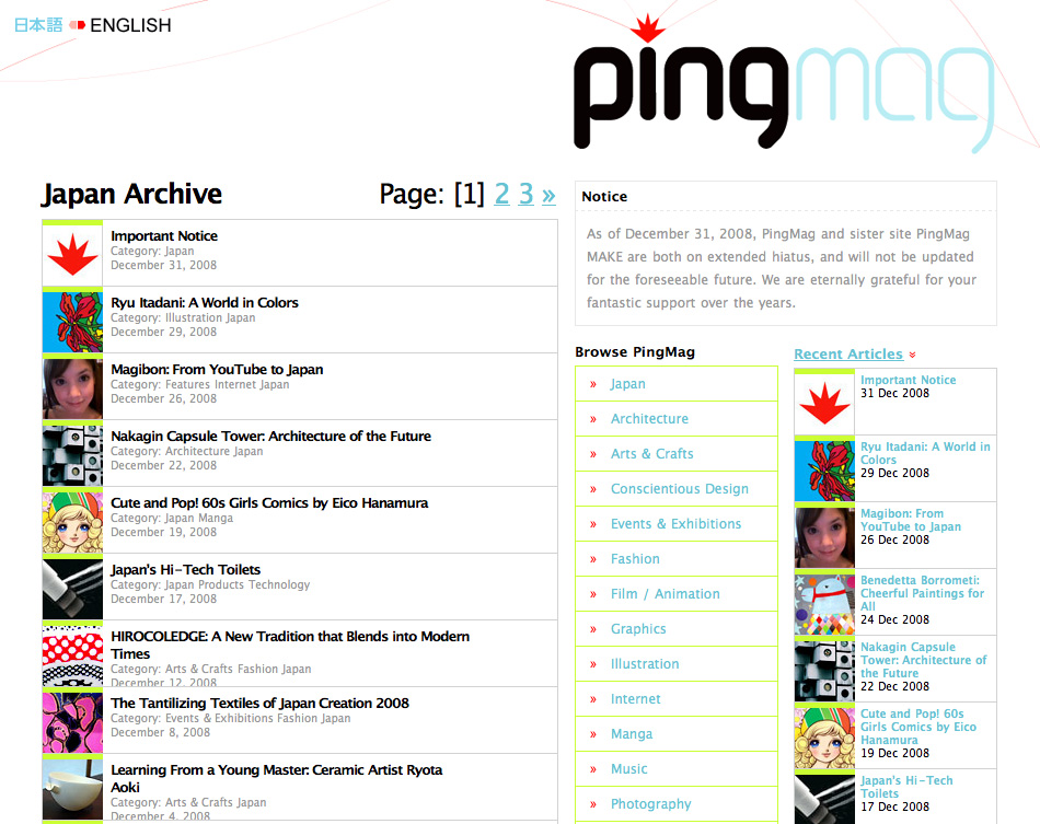
Link: Browse «Japan Archive» at PingMag ...
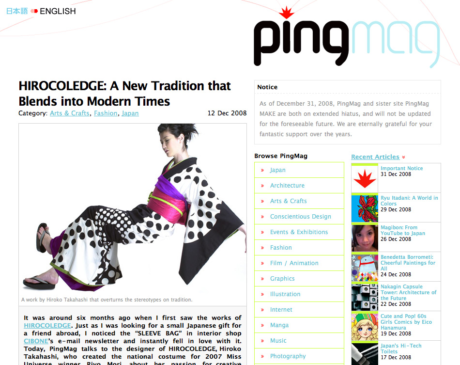
This website shows a friendly screen design and offers a large pool of interesting design-ideas. The site is paused since 2008 and will not be updated since then. Nonetheless it’s worth to browse the archive.
PingMag is an online design magazine based in Tokyo:
Defining the term design as broadly as we can, PingMag writes about ideas and inspiration coming from both world class designers, and from the little store on the corner. We look at everything; product design, packaging, architecture, web design, typography, illustration, photography, fashion, programming, graphics, video, art, toys, traditional crafts, graffiti, set design…. anything, in fact, that we consider inspiring and we think will excite you too.
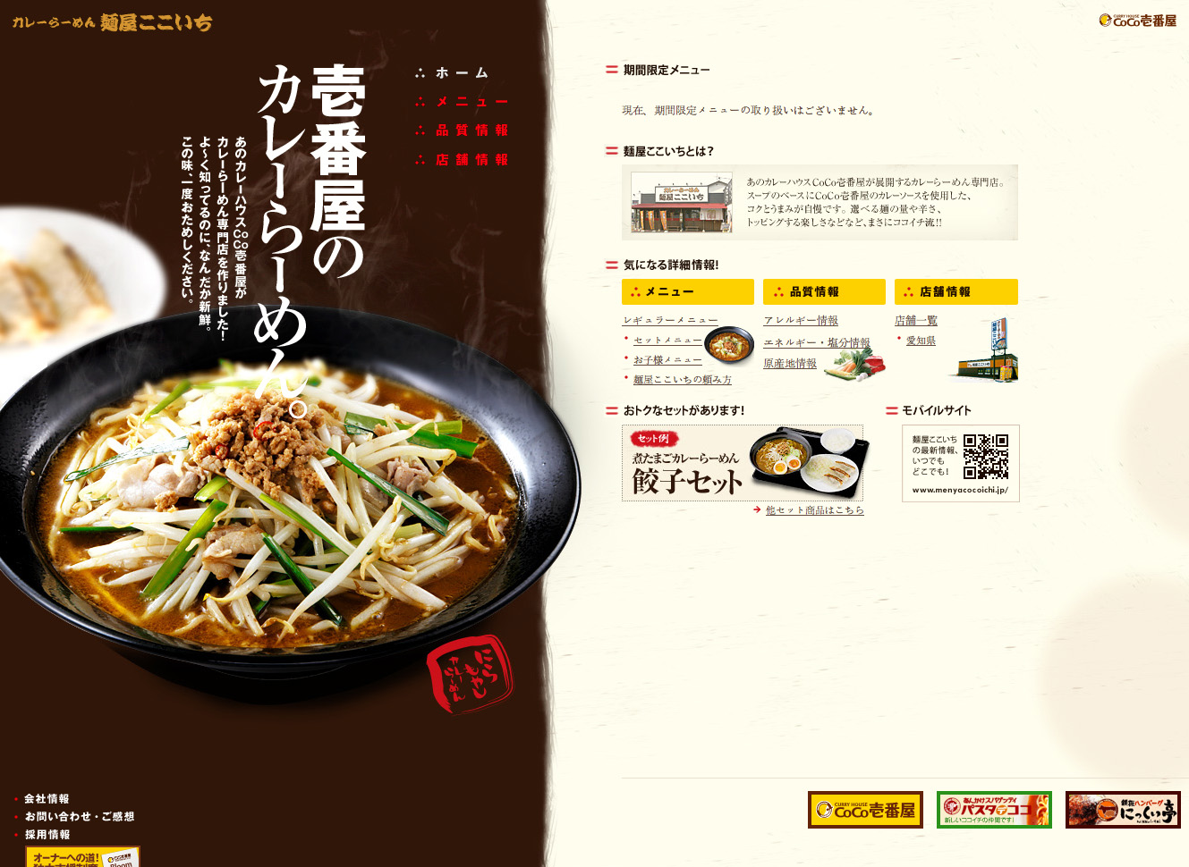
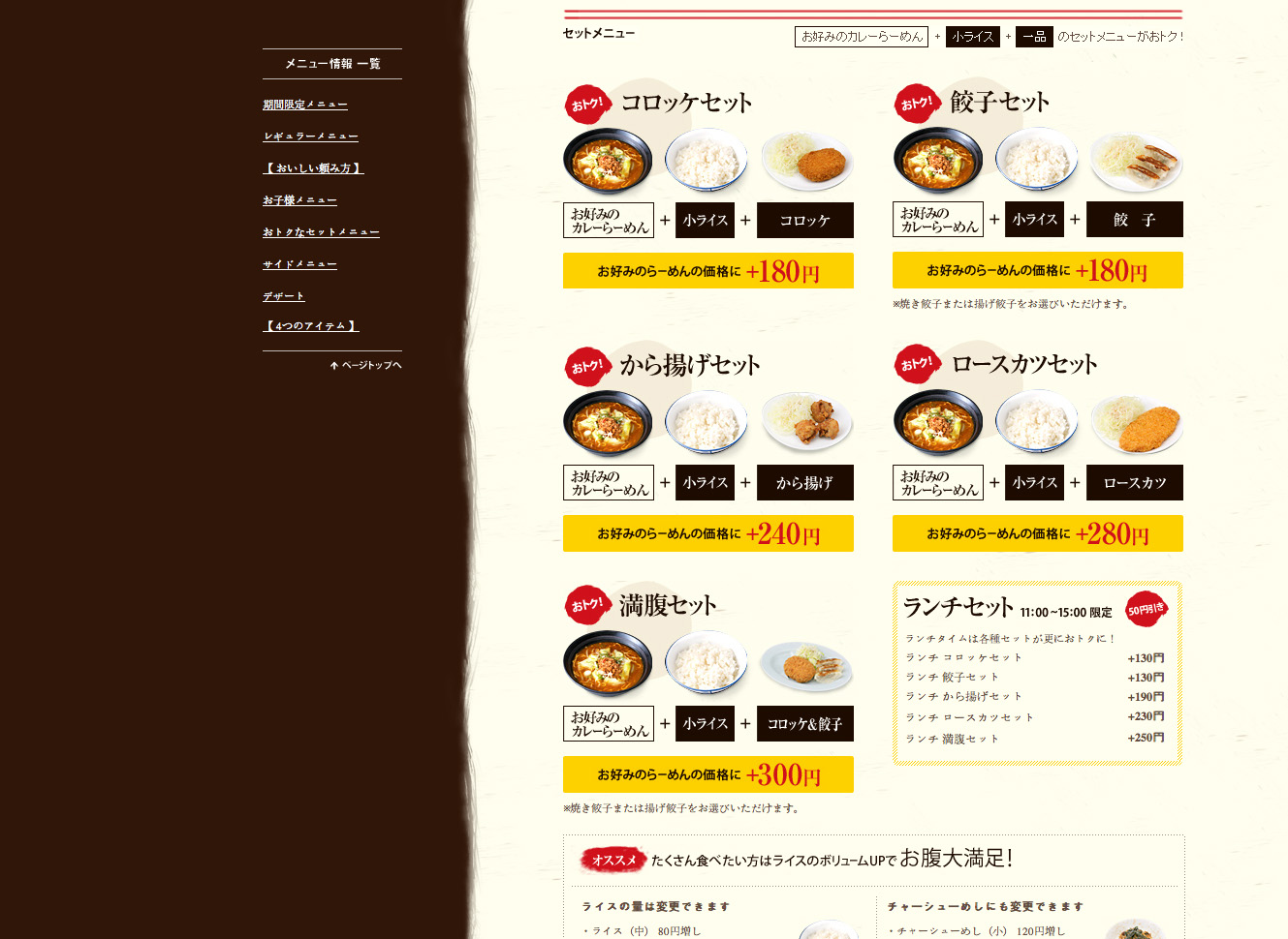
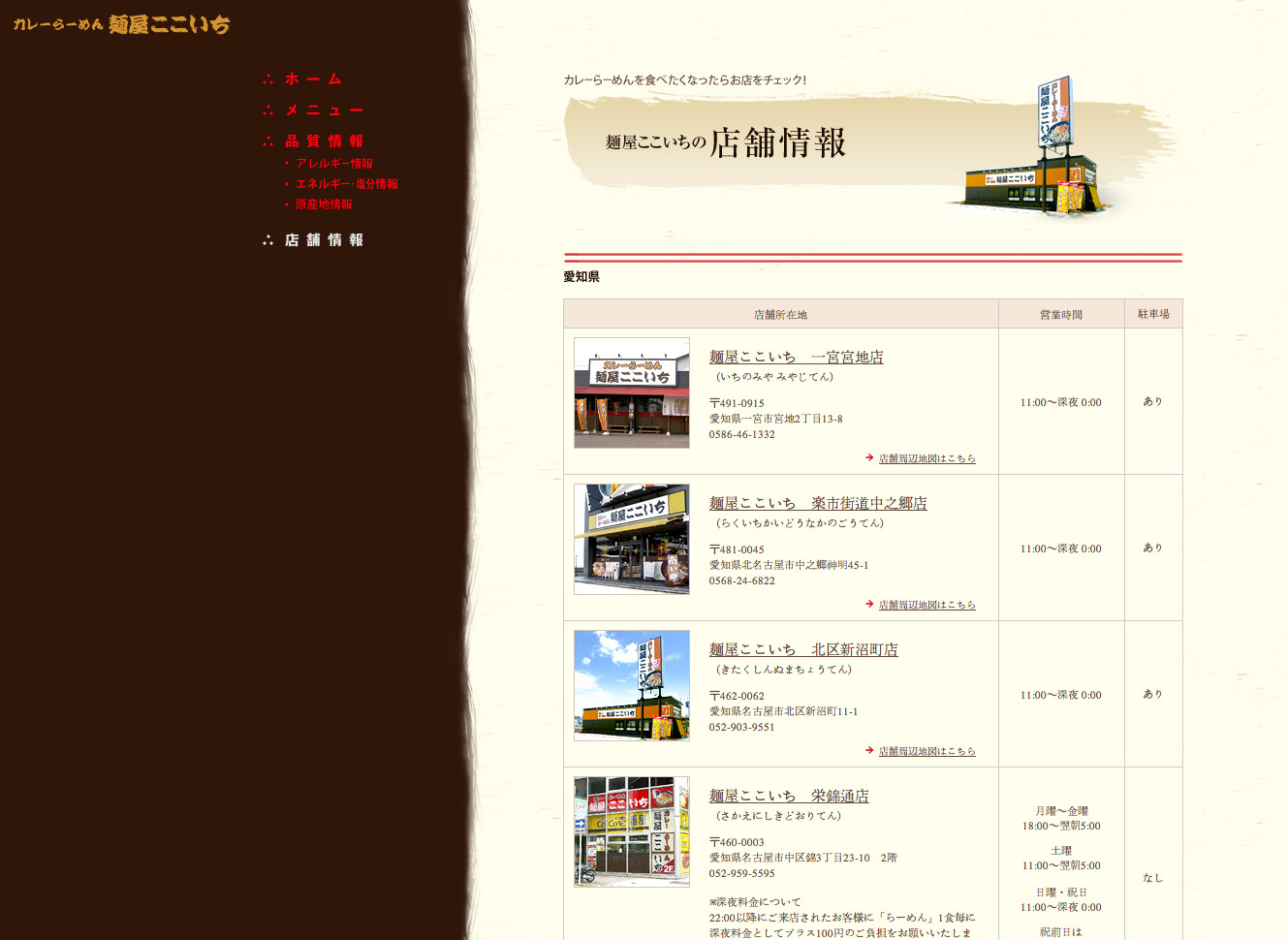
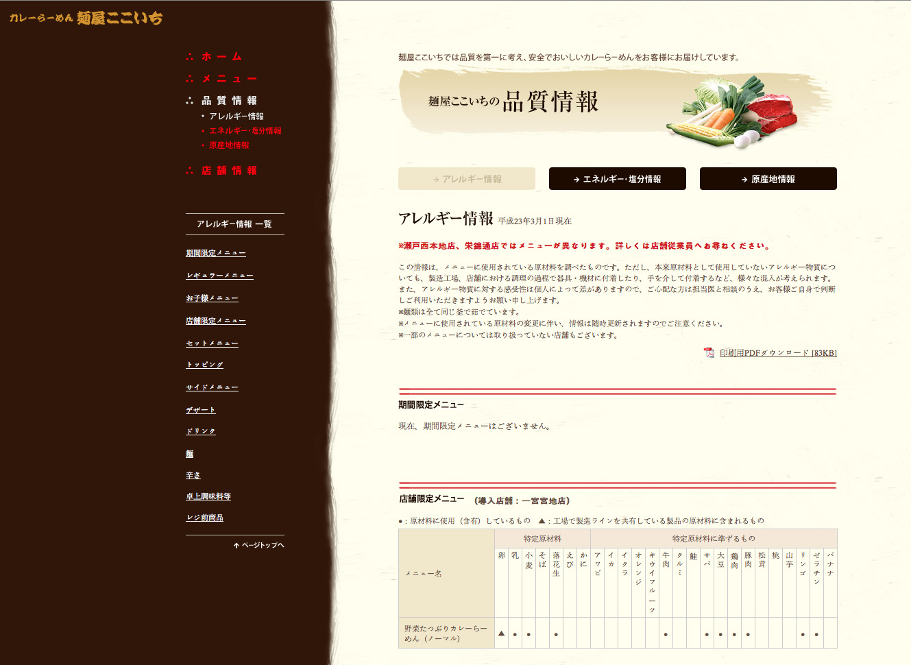
Link: Discover more - website of Menyacocoichi ...
Website with pleasing color-concept, unique layout and delicious food-photography. Very inviting.